
Availability is only the first step
A broad shade range can still be difficult to shop if the names are inconsistent, swatches are poorly lit, or deeper tones disappear from store testers. Shade inclusion has to work at the moment of choice, not only in a launch announcement.
Retailers can map shades across three separate questions: depth, undertone, and finish. A person may find the right depth yet reject a formula because its undertone looks different after it dries or because the finish changes the perceived color.
Make comparison possible
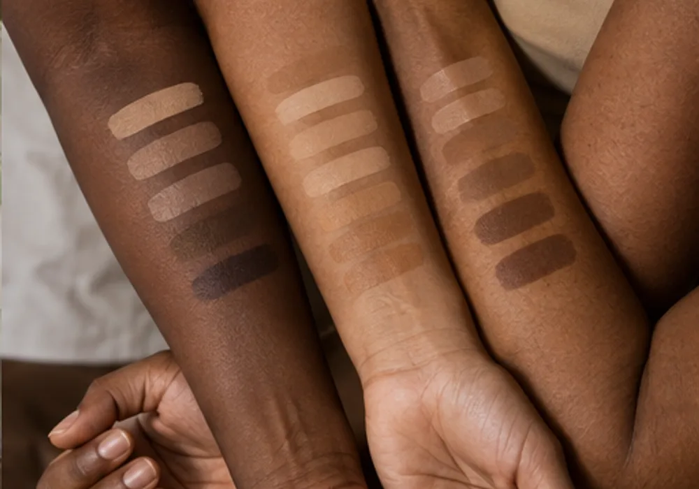
Useful shade content shows the same product in consistent lighting on multiple faces and skin tones. It also names the lighting conditions. A studio image can help a shopper compare colors, while a daylight image helps them anticipate how a shade might appear outside the store.
Sample sizes, clearly labeled testers, and simple exchange rules reduce the cost of a wrong guess. These operational details may be less glamorous than a campaign image, but they are often where inclusion becomes tangible.
Measure friction, not just launches
Teams should listen for recurring shade questions in customer service, note which shades run out at retail, and review why products are exchanged. Those signals cannot replace speaking with customers, but they can reveal where the shade system or shopping guidance is failing. A range should evolve as people use it.